


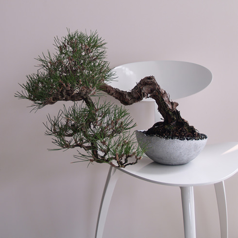
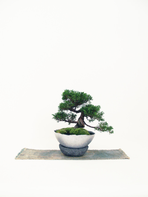
盆栽作家・島津拓哉氏の個人プロジェクト「たくぼん」のロゴデザイン。コンセプトは「た」。
島津氏のもつ、植物に向けられる優しい眼差しと思いを「takubon/たくぼん」の「た」の中に込めようと、「た」を頭文字とする言葉を拾い上げ、種を蒔き、植物とともに自分自身も成長していくストーリーとして展開し、それをコンセプトとした。
ロゴマークは、植物のもつ自然な動きと、植物に手を加えること生業にする盆栽家の技術を表現するため、手書きとし、新芽が伸びゆくさまを、頭文字「t」とも「た」とも見えるようにデザインした。
印象的な赤い丸(種)は、世界に盆栽の素晴らしさを発信していきたいと考えている島津氏の気持ちを、日本国旗と同色の赤を使うことで表現するとともに、島津氏自身の心を奮い立たせるものとしての意味を込めた。
A logo design for “Takubon” an individual project by Mr. Takuya SHIMAZU, a bonsai artist. The concept is “Ta”.
I picked up words that begin with “Ta” in order to put his gentle eyes and thought to plants into “Ta” of “Takubon”, and concepted as a story that a man seeds and growing up together with the plant.
I hand-wrote the logo for expressing a natural movement of plants and an expertise of bonsai artist who makes a living with trimming out plants, and I designed the logo so that it can looks the capital letter, “t” and also “た (ta)”, as a shoot grows.
The showy circle (seed) is expressed the thinking of Mr. SHIMAZU, that is to disseminate the beauty of bonsai to the world by using red, the same color of the Japanese flag, hinomaru. And it infuses the meaning of uplifting himself as well.
たね
たがやす
ためす
ただす
たもつ
たどる
たのしむ
たちきる
たえる
たたずむ
ただよう
たゆたふ
たくわえる
たたえる
たばねる
たしなむ
たとえる
たかめる
たかぶる
たくぼん
Seed
Cultivate
Try
Correct
Keep
Trace
Have Fun
Cut Off
Endure
Stand
Drift
Sway
Store
Admire
Bunch
Enjoy
Liken
Enhance
Grow
Takubon
Brand /
TAKUBON
Gallery Shimazuhttp://www.galleryshimazu.com/